Example 2
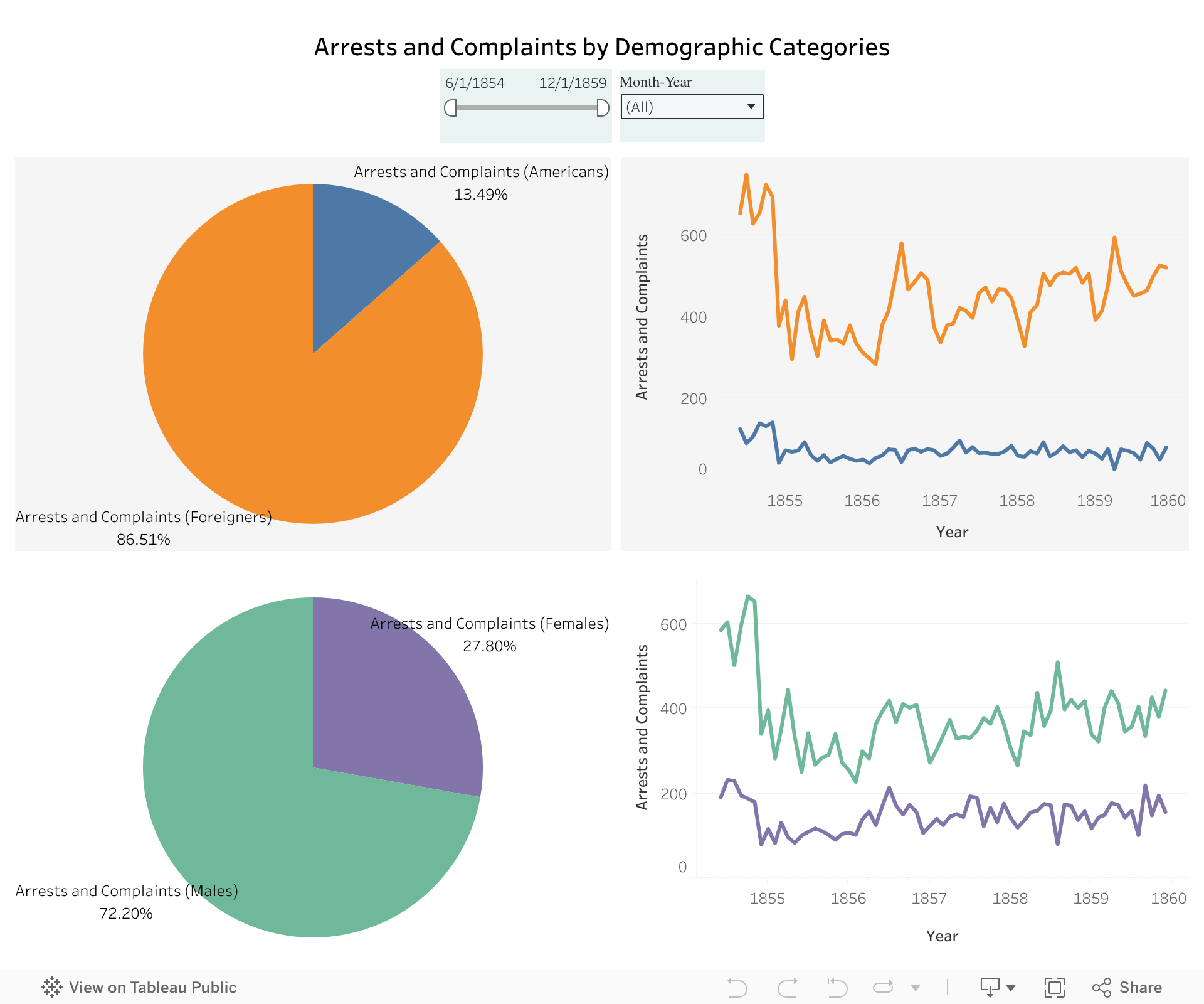
Which demographics make up the arrests and complaints?
Just like our first example, this is another interesting visulisation that might help inspire the users on how to use this dataset.
Captain Savage’s ledger recorded monthly arrest figures broken down by several demographic categories: American vs. foreign, resident vs. non-resident, and male vs. female.
We found the distributions in the American-Foreigner and male-female categories particularly interesting. We have translated this data into a series of pie charts and line graphs to highlight patterns across these demographic distinctions.
You can interact with the Tableau Visualisation here:
Several questions arise from the above visualization:
-
Why were significantly more foreigners arrested compared to Americans?
- Who was counted as foreigners? Who were counted as Americans?
- Was there a racial distinction?
- What was the form of identification for being American during this time?
- Almost one-fourth of all the arrests are females. As per that time period, is this significantly higher or lower than what is generally expected now? If so, what could be the reason for this discrepancy?
Many such questions can be asked on the basis of this data. We believe that this dataset can help you come up with more questions and invite you to explore this record book in more detail.